
Folders appeared in Start, but that's not all
Start is the key change in Windows 11, and in the 22H2 update, the developers finalized this menu, especially the Pinned Applications area. Now you can create folders in it - for this you just need to drag one icon to another. They can be renamed, moved and change the order of shortcuts inside.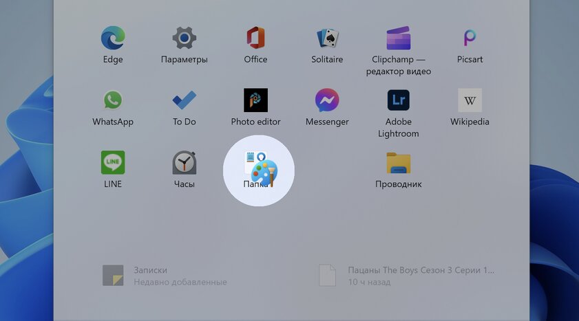
The process of dragging shortcuts is the same as in other operating systems
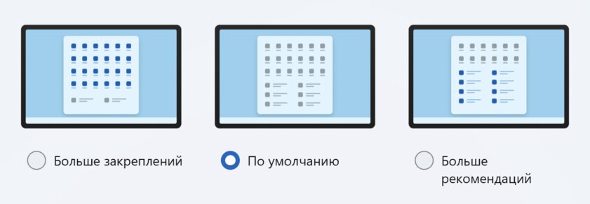
Separately, it is worth noting that it became possible to change the size of the pinned programs area itself: one row of icons more or less (this is done in the system settings). However, regardless of the size of the pinned apps bar, the Start menu itself will not change in height.
Taskbars brought back functionality, and the action center was rethought
Windows 11 has been most often criticized for its non-functional taskbar, which does not allow you to drag and drop files between applications. It took the developers a year to correct this misunderstanding - everything works as it should in the 22H2 update. Otherwise, the taskbar has remained unchanged: it's still the same simple minimalist strip, which I personally like even more than the old implementations. However, you should be prepared for the fact that it still cannot be moved to the right or top of the screen, and there is still no context menu by right-clicking. But the action center (the menu that slides out on the right) received several notable updates at once. It’s worth starting with the Focus Assistant button, which has been moved from the quick settings menu to the notification panel and renamed Do Not Disturb – here its location really seems more logical.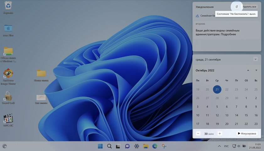
There is a new ability to bind a window, really convenient
Windows 11 introduces a brand-new Snap Assist feature that lets you quickly and easily rearrange windows around your screen. Initially, you could interact with it in two ways: by moving the cursor over the application window control (a list of available templates appears) or by dragging windows to the corners of the screen.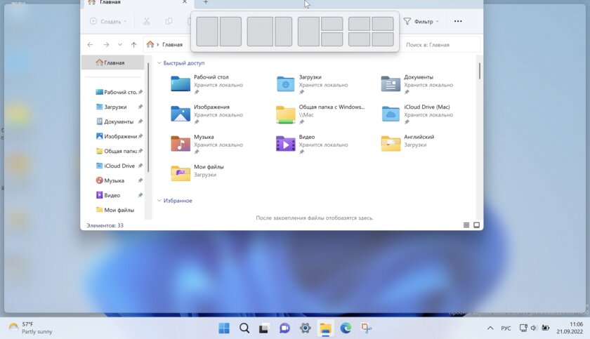
"Explorer" became the way it was expected immediately
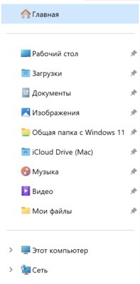
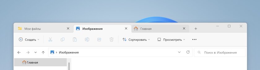
Perhaps most of the innovations in Windows 11 22H2 relate specifically to the built-in file manager. Particularly noticeable is the new main page, which opens by default when the application starts. The layout has changed a bit with new Favorites and Recent areas below the familiar Quick Access folders. Interestingly, Microsoft has moved user folders away from the This PC page, which now only shows drives. So if you want to access your user folders, you'll have to use the new File Explorer main page or sidebar. It took me a while to get used to this change, but now I'm completely comfortable with the new main page.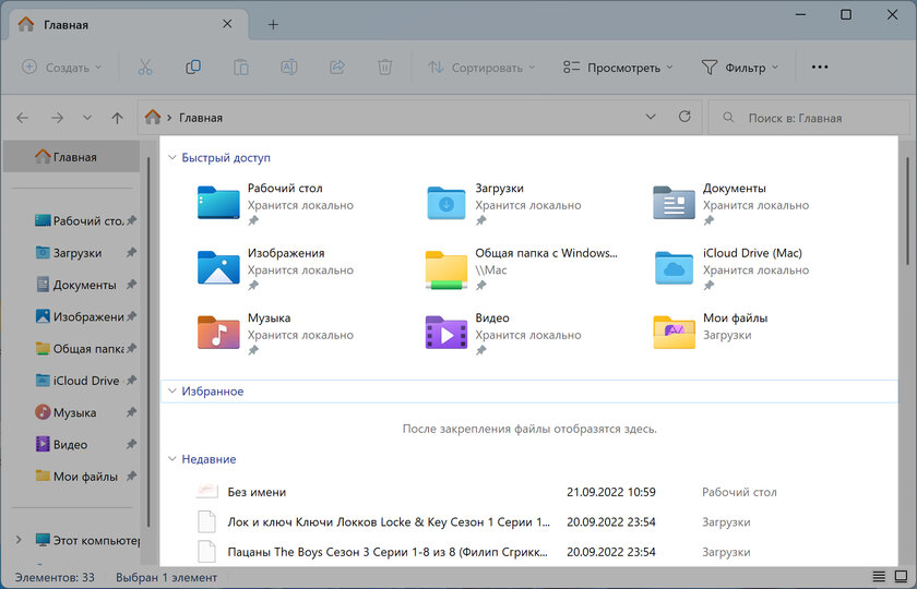
Don't forget about touch devices
Windows 11 is a system not only for PCs, but also for tablets with touch laptops. Microsoft was quick to bet on this, initially implementing several changes, such as removing the special "tablet mode" that touchscreen users were used to in Windows 10 last year, and instead adding small improvements to the desktop interface to make it more user-friendly. for touch use. In the 2022 update, developers have further improved this experience for touch interface users by introducing gestures that, with a simple swipe of a finger, allow access to common system areas such as the Start menu and Control Center. All new gestures available in version 22H2- Swipe up from the bottom of the screen to open the start menu.
- Swipe right on the start menu to open a list of all apps.
- Swipe up from the bottom right corner of the screen to open the control center.
- Swipe left or right with three fingers from the center of the screen to switch between open apps.
- Swipe up from the center of the screen with three fingers to go to the Task View.
- Swipe down the center of the screen with three fingers to minimize all running apps.
New settings, but not yet for everyone
As with all Windows updates, there are new settings to play around with. One notable option that has appeared is the "Spotlight wallpaper" feature, which picks up new wallpapers daily and sets them as your desktop background. This nice addition works similarly to the daily Bing wallpapers you get on your lock screen. Another notable new setting is in the Clipboard section. It's called "Suggested Actions" - if you turn it on, then when you copy a date or phone number, a small menu will appear offering quick actions to work with this data. For example, if you copy a date, a suggestion will appear with buttons that allow you to add that date to your calendar.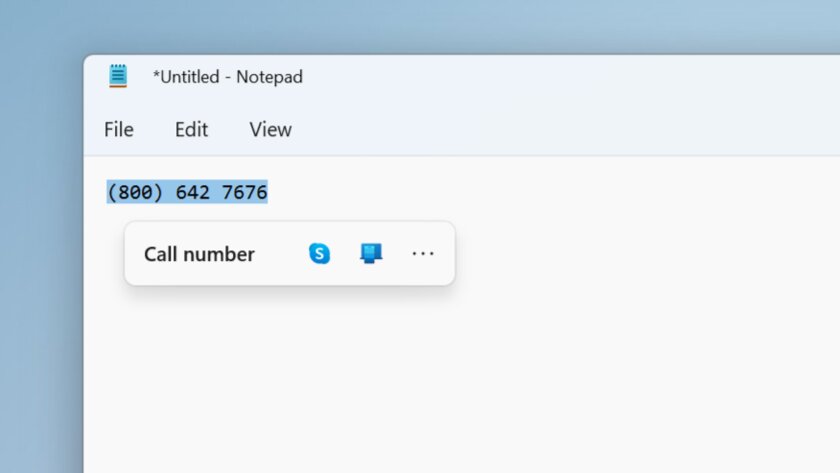
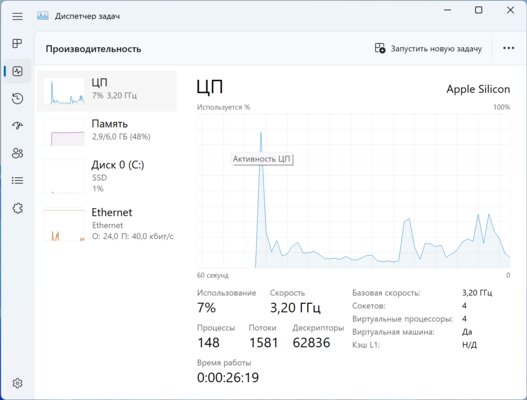
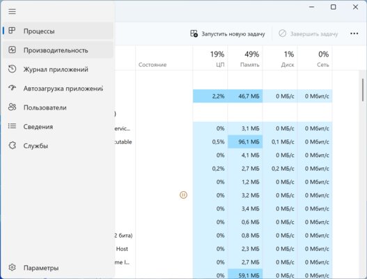
Transformed "Task Manager" and added new utilities
In the 22H2 update, the developers updated some existing utilities and added new ones. Most of all, the completely transformed Task Manager deserves attention - it received a new design that matches the visual style of the entire Windows 11. The last time the interface of this utility changed in Windows 8, that is, more than 10 years ago.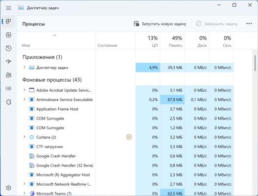
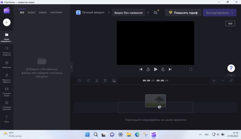
Windows has always lacked a simple video editor
The new Family Safety app is also a web app that simply points to the Microsoft Family Safety website, where you can add family members, track their location, approve purchase requests, share Office subscriptions, and stuff like that.
There are some shortcomings with the update as well.
Innovations are not always useful and desirable features. For example, you now need to use an online Microsoft account to set up a new Windows 11 22H2 PC. Previously, this was required only in the Home edition of the system, but now it has spread to Windows 11 Pro.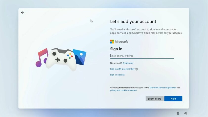
The button for using a local account is no longer there.
In other words, there is no longer a version of Windows 11 that ordinary consumers can purchase and set up without a Microsoft account. If you don't have an internet connection, you're just out of luck and won't be able to set up your PC. At least Microsoft wants you to think so.
There is a workaround that requires you to open a terminal and enter a special command that allows you to bypass the internet connection page and complete the setup using an offline account. But the fact that it needs to be done at all is annoying.
I'm a big fan of using a Microsoft account and use it on all of my Windows computers. I'm not saying that cloud accounts are bad. In fact, I even recommend using one on Windows. But the fact that Microsoft is trying to take away the ability to set up a new PC without an Internet connection seems absurd to me.
No other platform forces you to use an online account. Even Chrome OS doesn't require you to sign in with a Google account, it has a special guest mode if you want to use it. Apple doesn't force online accounts on macOS, iPadOS, or iOS, and Google doesn't require it on Android either.
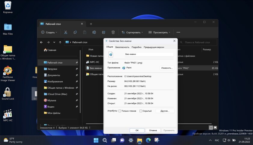
Another problem that has not gone away in Windows 11 22H2 is the incomplete adaptation of File Explorer to the dark interface. Many legacy elements of the system still support only light appearance, even with dark mode turned on. Whether you want to view the properties of a file or access an outdated utility from the Control Panel, you will be blinded by a white window every time.
The result is a useful update, but there is still work to be done
Update 22H2 has polished Windows 11 with some small but useful changes and additions that significantly improve the user experience. What are the long-awaited tabs in the "Explorer" and the redesigned "Task Manager", which harmoniously fits into the visual style of the entire system. But even with this update, Windows 11 is not completely finished: half-finished animations and a lack of adaptation to the dark theme are striking. And the need to use a Microsoft cloud account looks completely absurd. However, with the release of the 22H2 update, work on Windows 11 does not stop, the developers will continue to improve the system, including during 2023, so it should finally be completely ready.This is a translation of the Windows Central overview.
Source: Trash Box
social bites
social bites
social bites
social bites
social bites
social bites
social bites
social bites
social bites
social bites
social bites
social bites
social bites
social bites
social bites
social bites
social bites
social bites
social bites
social bites
social bites
social bites
social bites
social bites
social bites
social bites
social bites
social bites
social bites
social bites
social bites
social bites
social bites
social bites
social bites
social bites
social bites
social bites
social bites
social bites
social bites
social bites
social bites
social bites
social bites
social bites
social bites
social bites
social bites
social bites
social bites
social bites
social bites
social bites
social bites
social bites
social bites
social bites
social bites
social bites
social bites
social bites
social bites
social bites
social bites
social bites
social bites
social bites
social bites
social bites
social bites
social bites
social bites
social bites
social bites
social bites
social bites
social bites
social bites
social bites
social bites
social bites
social bites
social bites
social bites
social bites
social bites
social bites
social bites
social bites
social bites
social bites
social bites
social bites
social bites
social bites
social bites
social bites
social bites
social bites
social bites
social bites
social bites
social bites
social bites
social bites
social bites
social bites
social bites
social bites
social bites
social bites
social bites
social bites
social bites
social bites
social bites
social bites
social bites
social bites
social bites
social bites
social bites
social bites
social bites
social bites
social bites
social bites
social bites
social bites
social bites
social bites
social bites
social bites
social bites
social bites
social bites
social bites
social bites
social bites
social bites
social bites
social bites
social bites
social bites
social bites
social bites
social bites
social bites
social bites
social bites
social bites
social bites
social bites
social bites
social bites
social bites
social bites
social bites
social bites
social bites
social bites
social bites
social bites
social bites
social bites
social bites
social bites
social bites
social bites
social bites
social bites
social bites
social bites
social bites
social bites
social bites
social bites
social bites
social bites
social bites
social bites
social bites
social bites
social bites
social bites
social bites
social bites
social bites
social bites
social bites
social bites
social bites
social bites
social bites
social bites
social bites
social bites
social bites
social bites
0 Comments
Any Queries , You May Ask